Hello Babe—picking paint can feel like picking a baby name in the hospital lobby: high stakes, low patience, and everyone has an opinion. After years of trial and error (and a few frantic late-night repaints), I finally embraced a product management style approach. In PM we ask, “What problem am I solving?” At home, I ask:
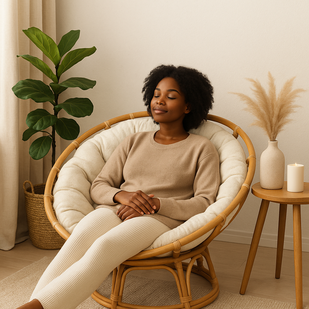
“How do I want this space to make me feel?”
Calm? Inspired? Energized?
Once the feeling is clear, I list the objects, memories, textures, and places that evoke that feeling for me. That instantly narrows me to a color family—then I pull swatches and paint samples. No more comparing ten random colors from ten different families and spiraling. Here’s my full, mama-tested method.
Step 1: Name the Feeling (Your Product Vision)
Close your eyes and imagine a regular Tuesday in that room. What do you need from it?
- Calm – “Let my nervous system breathe.”
- Inspired – “Give me focus and creative flow.”
- Energized – “We host, we dance, we live!”
Write the feeling at the top of a note. This is your north star.
Step 2: Gather Your “Mood Anchors” (User Research, but Cute)
Ask: What things reliably trigger this feeling for me?
Examples from my own life as a first-gen African mom:
- Textures: woven baskets, linen, velvet, Sierra Leonean country cloth
- Places: beach at dawn, rainy market streets, art galleries
- Memories: Sunday jollof and laughter, grandma’s gold bangles
- Wardrobe hints: the neutrals you reach for, the bold prints you love
Jot down 3–5 anchors. You’ll translate these into a color family next.
Step 3: Translate Feeling → Color Family (Scope the Solution)
Use this quick mapping to narrow your lane:
| Feeling | Anchors & Cues | Likely Families | Sample Ideas* |
|---|---|---|---|
| Calm | Linen, seashells, soft rain, quiet mornings | Warm greiges, gentle greens, soft creams | SW Accessible Beige, SW Sea Salt; BM Classic Gray |
| Inspired | Woven art, libraries, studio vibes, deep blues | Moody blues/greens, muted teals, complex neutrals | F&B Inchyra Blue, SW Pewter Green; BM Hale Navy |
| Energized | Market day, citrus, music, movement | Terracottas, saffron/golds, lively corals | SW Cavern Clay, BM Caliente; accents in warm gold |
*Paint lines vary—always test at home!
Pro tip: If your anchors shout “woven naturals + beach,” skip the charcoal blacks. Stay in one family for your first round of samples. That’s how you avoid analysis paralysis.
Step 4: Reality Check (Constraints = Your Best Friend)
Like any good PM, check constraints before you commit:
- Light: North light reads cool; south light warms everything.
- Fixed finishes: Floors, tile, counters, and big furniture win—your paint should play nice with them.
- LRV (Light Reflectance Value): Lower LRV = moodier; higher LRV = airier. Small rooms can still wear dark colors—just pair with light textiles and generous lighting.
Step 5: Build a Mini Palette (MVP, But Make It Pretty)
Choose 3–5 swatches all within your chosen family:
- Main wall color
- Trim/cabinet option (often a crisp or creamy white)
- Ceiling or accent (optional)
- One wild card (still in the family—e.g., slightly greener version)
Step 6: Sample Like a Pro (Test With Real Data)
- Paint two coats on 12×12 foam boards or large peel-and-sticks.
- Move them around: morning, noon, evening, lamps on/off.
- Hold against floors, tile, sofa fabric, curtains—not just bare drywall.
- Eliminate fast: anything that goes dingy or neon under your lighting is out.
Step 7: Decide & Document (Ship It!)
Pick the winner and write down:
- Color name & number
- Brand & store
- Finish (eggshell for walls, satin/semigloss for trim)
- Room & date
Trust me—future you will thank you when you touch up six months from now.
A Real Example From My Home
Feeling: Energized, social, “turn-on-the-music” vibes.
Room: Basement (our little party zone).
What mattered: I wanted the Custom Ankara wall prints to shine, let my old-school African gallery wall live its best life, and make those burnt orange bar stools be my bold pop of color.

Main color: Sherwin-Williams Drift of Mist (walls)
Why it works: it’s a soft, airy neutral with just enough warmth to energize under basement lighting without fighting bold art. It acts like a clean gallery backdrop—colors read true, prints stay the star, and those stools? Instant focal points.
Mini palette I used:
- Walls: SW Drift of Mist (eggshell)
- Trim/doors: Soft white (satin) for crisp edges and bounce
- Metals: Warm brass + matte black for collected, Afro-modern polish
- Accents: Burnt orange, olive green, and a little greenery to keep it lively


Result: A basement that feels bright, social, and ready for a vibe—art-forward without visual clutter, with color pops that dance against the neutral walls. Exactly the mood I wanted for an at-home party space.
Common Questions (Because We’re Human)
Do neutrals count as a mood?
Absolutely. The right neutral is a feeling—cozy, bright, or chic—based on undertone (pink/yellow/green/gray) and your lighting.
How many samples is too many?
Sweet spot is 3–5. More than 6 and decision fatigue sets in.
Can dark colors feel calm?
Yes—choose muted, grayed-down tones (think deep blue-green over true black) and add soft textiles and warm lamps.
What finish should I pick?
- Walls: eggshell or matte scrubbable
- Trim/doors: satin or semigloss
- Ceilings: flat
Related Reads & Next Steps
- Start with my companion post: My Favorite Paint Colors & Where to Use Them (read this next to see real shades in action!)
- Then dive into: Mixing Textures & Patterns in Afro-Modern Interiors (so your new paint plays nicely with textiles and art).
Need a second set of eyes? I offer mini design consults for paint + palette decisions—perfect for busy moms who don’t have time for a repaint. (SparkSynergy clients, I see you! 😉)
✨ If this helped, share it with a mama who’s standing in the paint aisle looking overwhelmed. We’ve all been there. With a feelings-first approach, you’ll choose once—and love it every day.